Statistical Data Analysis 101
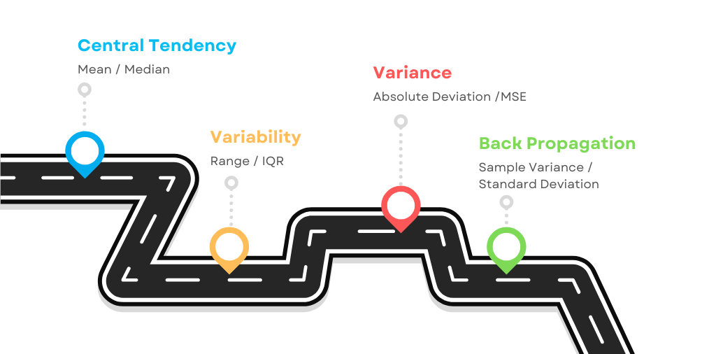
Bloody Beginners Guide. Part I
In this article we will take a look at the basic concepts of Statistical Analysis. We will be using the R programming language to visualize essential details, so download RStudio Desktop and install both R and R studio. If you are not comfortable programming at all, then check out my previous post about how to start coding and build the basics of using Terminal and VS Code. Even though it's not covering the R, it still a good point to start.
Now let's kick-off with the following command to generate random dataset. Print the entire block of the code into R studio editor, then select the code you want to run and press Ctrl + Enter.
set.seed(123)  # Allows you to reproduce the same random data as mine
data <- rnorm(100, mean = 50, sd = 10) # Generating a random dataset
data # Calling the dataset to be printed in the console
Everything after the hash sign # is a comment for you ro read, it's not part of the code.
Measure of Central Tendency
The most basic concept of statistical data analysis is the average expected value. Let's find the mean and median average points in our dataset that we've just created. Building the visual graphs helps to make it clear at glance. We will start with the mean.
Arithmetic Mean
The mean, of course, is just a ratio between the amount of values and total number of observations. It sounds simple, but look at this scary formula. It's worth breaking it down and memorizing, as you will see it more often on your learning journey.
Mean Formula:
x̄ = (1/n) × Σ(xᵢ) for i=1 to n
Where:
- x̄ (x-bar) = the mean
- n = number of observations
- Σ (sigma) = sum of all values
- xᵢ = individual values
Formula Explanation
The mean, denoted by x̄, equals the sum of all values (expressed by Σ from i=1 to n of xᵢ), and the multiplication by (1/n) is merely a division by the number of observations. It's fair enough to interpret this formula as:
x̄ = (x₁ + x₂ + ... + xₙ) / n
Now enough of math! Let's visualize our dataset using histogram. Also we will draw two absolute lines, the red line indicating the mean, and the green line representing the median.
# Plotting the data
hist(data, main = "Measure of Central Tendency",
           xlab = "Values",
           ylab = "Observations",
           col = "lightblue", border = "black")

# Adding a vertical line for the mean and median
abline(v = mean(data), col = "red", lwd = 2)
abline(v = median(data), col = "green", lwd = 2)
# Getting the values
print(mean(data))
print(median(data))
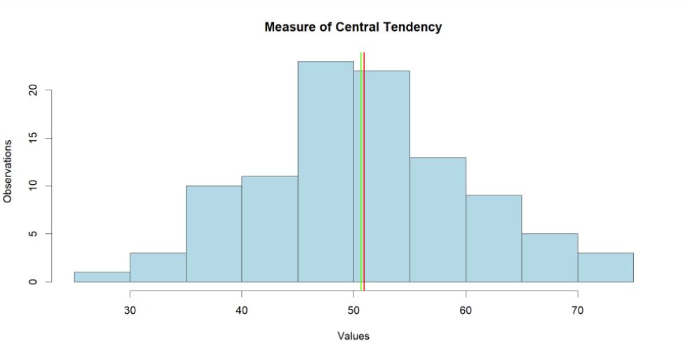
Looking at the graph we can see the mean and median both at the center, as expected. The console line calculated $50.90 and $50.61 as the mean and median respectively.
But what is this median and why do we need it?
Median
Unlike the mean, the median (denoted by x̃) is the exact middle value in the dataset. It's pretty much straightforward with odd numbers of observations, you just sort the spendings in ascending order and point to the value in the middle. As the formula suggests - divide the number of observations by 2 and round it upwards. That's your median!
Median Formula (odd number of values):
x̃ = x₍ₙ₊₁₎/₂
However our dataset has even 100 values. In this case the division by 2 would not result with the value in the middle. So in this case we have to find the arithmetic mean between the two values closest to the middle. That would be the sum of number 50 and 51, divided by 2.
Median Formula (even number of values):
x̃ = (x₍ₙ/₂₎ + x₍ₙ/₂₊₁₎) / 2
Use the following script to get a new random distribution, but less symmetric this time.
set.seed(123)  # Keep this for reproducibility
# Generating a new random dataset with a longer tail on one side
data <- c(rnorm(80, mean = 50, sd = 10), rnorm(20, mean = 80, sd = 10))

# Plotting the data
hist(data, main = "Measure of Central Tendency",
           xlab = "Values",
           ylab = "Observations",col = "lightblue", border = "black")

# Adding an absolute line for the mean and median
abline(v = mean(data), col = "red", lwd = 2)
abline(v = median(data), col = "green", lwd = 2)
# Getting the mean and median value in bash style
cat("Mean:", mean(data), "\n")
cat("Median:", median(data), "\n")
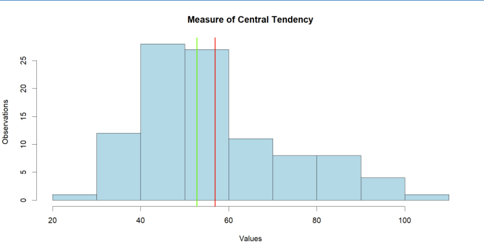
Note how the median and mean are further apart from each other, to be precise they are $52.78 and $56.90 respectively. That's due to the fact that we've defined some spendings to be more than $100. And that's why we use median more often, cause it's resistant to the outliers and always point to the middle value unlike the mean.
Quantiles
A quantile divides the dataset into several equal parts. The median is actually a particular case of a quantile which divides the dataset into two quantiles. Let's create a couple of variables using the 'quantile()' function.
# Defining median using quantiles function
my_median <- quantile(data, probs = c(0.50))

# Creating histogram plot
hist(data, main = "Median",
     xlab = "Values",
     ylab = "Observations",col = "lightblue", border = "black")

# Drawing a quantile
abline(v = my_median, col = "orange", lwd =2)
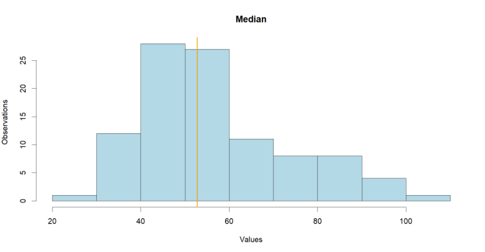
In this way we divide the dataset into two quantiles, everything above the median and everything below it. The dataset maybe sliced in any given number of quantiles. Let's cut it down to four quartiles.
# Defining quartiles
quartile <- quantile(data, probs = c(0.25,0.50, 0.75))

# Creating histogram plot
hist(data, main = "Quartiles",
     xlab = "Values",
     ylab = "Observations",col = "lightblue", border = "black")

# Drawing a quantile
abline(v = quartile, col = "orange", lwd =2)
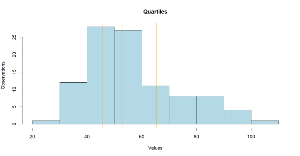
Now we have four equal quantiles in terms of total amount of values, but notice the difference in range. We can keep slicing and dicing the distribution to quintiles and deciles or even percentiles if you need to. But we will move on to the next concept.
Measure of variability
The Central tendency is not the only measure to look at when analyzing the data. Now imagine you've been set for a business trip to three different cities. Let's check the weather to make an assumptions on how to dress and what clothes to pack in your luggage.
| City | Monday | Tuesday | Wednesday | Thursday | Friday | Saturday |
|---|---|---|---|---|---|---|
| Lulea | 0 | 0 | 0 | 0 | 0 | 0 |
| Columbus | -5 | 5 | -5 | 5 | -5 | 5 |
| Dublin | -30 | -10 | 10 | 10 | 10 | 10 |
If you take the weekly average temperature for each city of Lulea, Columbus or Dublin you will get the exactly same 0°C in every city. We don't care about the mean in this situation, but what we do care about - is the range or spread of the values.
Range
Calculating the range is pretty simple. You sort the values in ascending order, then find the difference between the maximum and minimum values. However be aware that just like an avarage, the range is quite sensitive for outliers.
Range Formula:
Sort values: x₁ ≤ x₂ ≤ ... ≤ xₙ
Range (R) = xₙ - x₁
Example:
R(Dublin) = 10 - (-30) = 40
Interquartile Range
Since all outliers are usually marginal values, they should lie on either edge of the dataset i.e. within the first or fourth quartile. That's why the Interquartile Range or IQR for short is used to eliminate the outliers impact. We slice the dataset to contain only the second and third quartiles, and that is the sweetest data for us to make an assumptions on.
IQR Formula:
IQR = x̃₀.₇₅ - x̃₀.₂₅
(This is the 75th percentile minus the 25th percentile)
Let's create a new data for order transactions and group it by the payment providers. Now run the following script to create the dataframe.
set.seed(123) # Keep this for reproducibility

# Create a new dataset for
data1 <- c(rnorm(50, mean = 150, sd = 30), rnorm(50, mean = 200, sd = 40), 300)
data2 <- c(rnorm(50, mean = 180, sd = 20), rnorm(50, mean = 220, sd = 30), 250)
data3 <- c(rnorm(50, mean = 160, sd = 25), rnorm(50, mean = 210, sd = 35), 270)

# Create the data frame
df <- data.frame(
  Group = rep(c("Jusan", "Halyk", "Kaspi"), each = 101),
  Values = c(data1, data2, data3)
)
Further we will use the advance visualization 'ggplot2' library to create the boxplot that will enable us to assess measures of variability and central tendency alike.
The installation would be required first, and then you can run the boxplot script.
# Installing ggplot2 library
install.packages("ggplot2")
# Importing it
library(ggplot2)
# Creating a boxplot
ggplot(df, aes(x = Group, y = Values, fill = Group)) +
  geom_boxplot(notch = TRUE, color = "darkblue", alpha = 0.7) +
  labs(title = "Comparison of Three Groups",
       y = "Values", x = "Groups") +
  theme_bw() +
  scale_fill_manual(values = c("Jusan" = "darkorange", "Halyk" = "darkgreen", "Kaspi" = "#bd1206"))
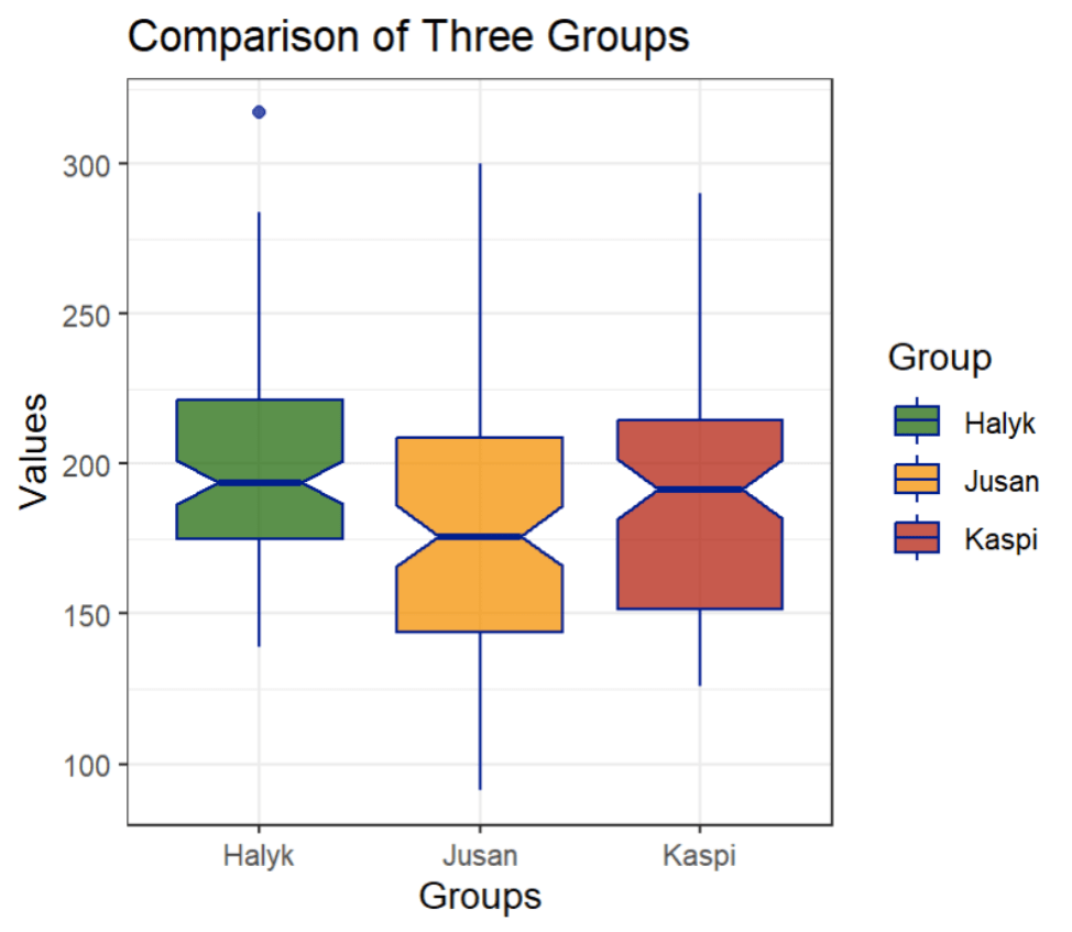
Looking at this graph we can see three different plots representing 'Halyk', 'Jusan', and 'Kaspi' in green, orange and red respectively.
Think of the sandglass shape like this: the middle line is the median, the whole sandglass thing is the IQR. The bottom part is the second quartile, the top part is the third quartile, above it is the fourth quartile, and below the IQR is the first quartile. And the outlier? It's a lonely point that separated from the Halyk Group boxplot.
If you made it this far, then congrats fellow! You've learn how to perform decent descriptive analysis using measures of Central Tendency and Variablity. The next section would get a little bit tricky, but pretty much exciting for nerds like me.
Variance
Sometimes we have to understand how far the values in the dataset from the mean or median. That helps both in Statistical and Machine Learning.
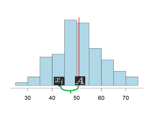
Absolute Deviation
The absolute deviation is the sum of differences between the average and each and every given value of the dataset divided by total observations. The math is pretty much straightforward.
Absolute Deviation Formula:
D = Σ(xᵢ - A) / n for i=1 to n
Where:
- D = deviation
- A = average (mean or median)
- xᵢ = individual values
- n = number of observations
However, there is a technical problem with this formula, it would only work if our distribution doesn't have any negative value within it, just like our dataset happens to be.
Otherwise, just like with the weather example where the negative and positive values cancels eachother out, it would be rather meaningless to have 0 deviation at actual 10°C range, so for this reason the formula has been modified to use absolute values (modules) like so:
Modified Formula:
D = Σ|xᵢ - A| / n for i=1 to n
The vertical bars | | represent absolute value, which makes all differences positive.
Depending on your requirements you may need either an Absolute Median Deviation:
D(x̃₀.₅) = Σ|xᵢ - x̃₀.₅| / n for i=1 to n
Or an Absolute Mean Deviation:
D(x̄) = Σ|xᵢ - x̄| / n for i=1 to n
Essentially the same thing, but different point of reference to the average.
Back Propagation
Absolute values do a great job eliminating the problem of negative values. However when the task requires optimization for machine learning algorithms like neural networks for instance, then the Absolute Values become a huge problem.
How does a machine learn to distinguish between cat and dog? It learns through a process of back propagation: it gives a shot saying "cat is dog", it then receives an error, this error is propagated back to the algorithm optimizing through yet another numerous iteration.
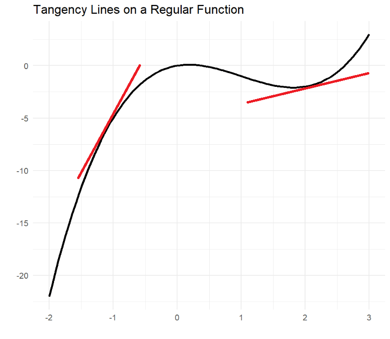
At the very core of its engine, neural networks use a function's derivative to adjust itself in case of error. But what happens if the algorithm uses absolute deviation?
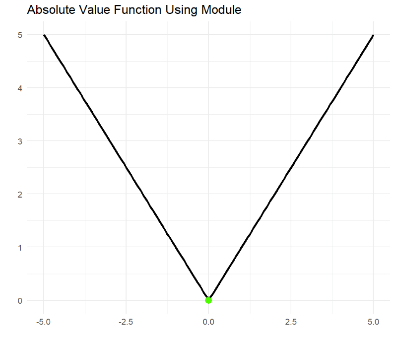
The Absolute Value Function gets to a corner point where the Lipschitz condition is violated, and no derivative is available to propagate the error back to the machine, hence the neural network algorithm breaks.
Mean Squared Error
Finding the derivative requires a tangent line that gives the machine a new direction to adjust itself. Therefore the Absolute Deviation evolved into Mean Squared Error which uses square instead of absolute value.
Mean Squared Error Formula:
S²(A) = Σ(xᵢ - A)² / n for i=1 to n
This allows keeping absolute values and the function's derivative both at the same time, and that optimizes back propagation to work as expected.
Sample Variance
The optimization task always requires Mean Squared Error to be as minimum as possible. That's pretty obvious! We want our neural network to be precise, and not making any mistakes, hence the name Mean Squared Error. The MSE gets its minimum value when the Central Tendency equals the Arithmetic Mean (A = x̄), and that's called Sample Variance.
Sample Variance Formula:
S̃² = Σ(xᵢ - x̄)² / n for i=1 to n
It may feel a bit off to use square values, but so what? We don't care about actual values if it allows the machine to learn how to distinguish between cancer and healthy cells, right?
Standard Deviation
In the end if the original values are required, we are always allowed to apply the square root to the Sample Variance, and that's how the Standard Deviation kicks into the game.
Standard Deviation Formula:
S̃ = √[Σ(xᵢ - x̄)² / n] for i=1 to n
Or written out:
S̃ = square root of [(1/n) × sum of (xᵢ - x̄)² for all i from 1 to n]
That's enough for an introduction into Statistical Data Analysis, I hope you enjoyed.
Yours,
Bad Dog